


Analytic and Enumerative Studies: Thinking about Control Charts-1

W.E. Deming articulated the difference between analytic and enumerative studies starting in the 1940s.
If you sample a batch of items from a production process, an enumerative study will ask questions like “is the quality of this specific batch good enough to use?” You will act on the batch in front of you, right now—to reject it, to rework it, to pass along to the next stage. Of course, the batch size could be just one unit.
An analytic study, on the other hand, asks what the batch in front of you tells about the production process that made the batch. Do you need to hunt for problems in the process right now or should you leave the process alone to have good product tomorrow? Is the production process predictable or not? Analytic studies inherently concern the future.
I summarized Deming’s two types of studies in this post, in a discussion of random sampling and the use of p control charts.
In this post, I use Deming’s sampling picture to think more about the assumptions used to justify control charts for rates. The picture is from W.E. Deming (1953), “On the Distinction between Enumerative and Analytic Surveys”, Journal of the American Statistical Association, 48:262, 244-255.)
No-Show Rates in Dental Clinics
In work this past year to improve oral health, dental clinics in community health centers tracked and shared their “No-Show” rates. Many clinics have no-show rates higher than 20%, a level that makes it difficult to plan care and deliver oral health services efficiently. Changes to appointment scheduling and workflow can dramatically decrease no-show rates; tracking no-shows thus shows whether these changes work as intended. As clinics typically track no-show rates as part of normal business, we have an indicator that doesn’t require new work for staff.
Here’s the record of no-show data from Clinic A:
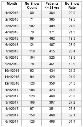
From the table, we can make run charts of the monthly patient count and rate of no-shows in Clinic A.

If we apply the run chart rules posted here, we might wonder about
(1) the five consecutive months of decrease in patient with appointments from August to December 2016;
(2) too few runs or a shift up in the rate chart, if you view the March 2016 value and the January 2017 value as equal to the median rather than the actual slight differences. It looks like the No Show rate may be increasing from January 2016 through June 2017.
Can we learn anything more about the No Show data by constructing a suitable control chart?
I’ll take up that question in Part 2 of this post.

