


Hybrid Control Chart to Visualize Covid-19 Pandemic Data

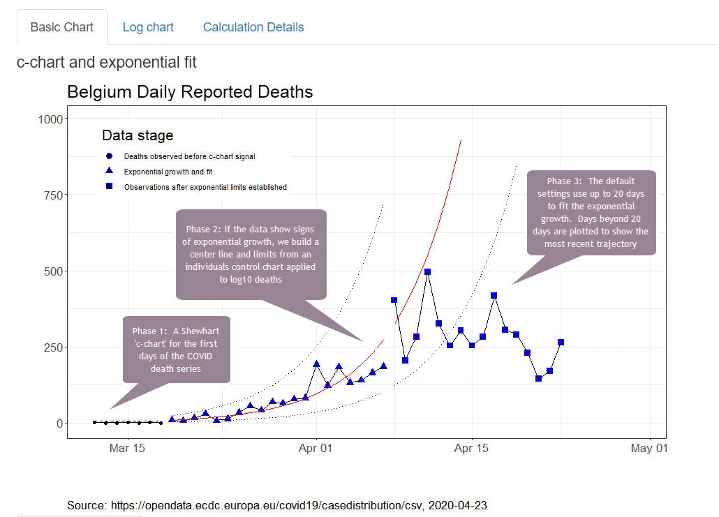
Over the last four weeks, I have worked with Lloyd Provost, Shannon Provost, Rocco Perla and Gareth Parry to develop a hybrid control chart. We built the method to view phases in daily reported events like deaths from COVID-19.
You can find a description of the method here.
For an introduction to the application of the method, here is an article from U.S. News and World Report.
The code is R and deploys a user interface using Shiny technology. The R code transforms a time series of daily reported events into charts that distinguish phases of COVID-19 infection for a reporting location like a country, state or city.
Who can use the method?
Anyone with a basic understanding of Shewhart control charts who wants to apply control chart methods to characterize COVID-19 events over time. People with skills in R can modify the code to to replace the built-in sources with custom sources.
Get the R code on GitHub
Click here to go to GitHub for the code.

