


Run Charts in Quality Improvement Work
Here’s an example of a chart of data—a run chart--produced by a hospital team seeking to reduce length of stay for patients with elective joint replacement surgery. Over 16 weeks they were changing process steps. Is there any evidence that their actions are having an effect?
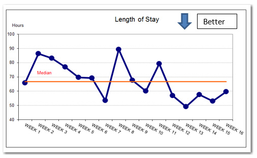
Lengths of stay for weeks 12 through 16 are below the reference median and the early data have several consecutive points decreasing. The number of discharges week to week were approximately the same except for Week 15, a holiday week with half the number of discharges. What should we conclude?
We don’t want to fool ourselves in claiming evidence of improvement where there is none. On the other hand, we don’t want to be so conservative that we ignore initial evidence of improvement and prematurely abandon useful change ideas.
To avoid either foolishness or over-conservatism, we can apply run chart rules that are based on simple probability models.
A classic guide to rare events in series of random data with two distinct values derives from a table produced by Swed and Eisenhart in 1943, “Tables for testing randomness of grouping in a sequence of alternatives”, Annals of Mathematical Statistics, 14, 83-86.
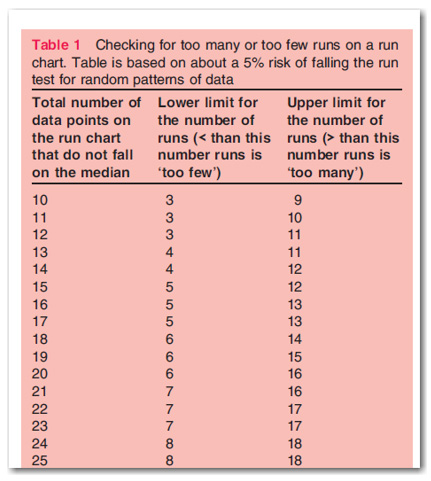
Perla et al (2011) show a version of the 1943 table particularly suited to run charts, a portion of which is shown here.
To apply the check for too many or too few runs, you have to adjust your count. As the series you’re analyzing gets longer, the limits for too few and too many runs also grow.
The dependence on series length is a complexity that may trip up people in practice. Perla and colleagues proposed a rule for detecting an unusual shift and a rule for detecting a trend that do not depend on the the length of the series plotted on the run chart. See Perla et al (2011) and Provost and Murray (2011).
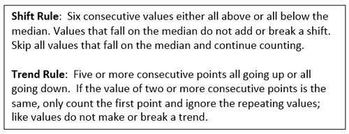
The simple rules are easy to remember and apply as improvers seek to be neither foolish nor too conservative.
The authors describe these rules as based on an approximate 5% chance of these patterns occurring in random data.
I looked at the performance of the rules and here’s what I conclude:
- The shift rule 6 on one side of median will signal no more than 5% of the time in series of n=12 to n=20 under random observations model (one-sided, because you should know which direction above or below median is improvement.)
- The shift rule 6 above or below a baseline median follows a different model than item 1 and is more likely to occur in random data—the relevant reference model now is the probability of seeing 6 heads or tails in a sequence of length N with a fair coin. For instance, the chance of seeing a sequence of six or more heads in 15 tosses of a fair coin is 0.09.
- The Trend rule needs to be carefully defined. Olmstead in 1945 defined a run up or down in terms of differences in the original series. In Olmstead language we have a run down of length 5 in the LOS graph--the LOS for Week 6 is in fact a bit lower than the LOS for Week 5in the raw data table I got from client. A run down of 5 in a series of length 16 will occur by chance less than 2% of the time. A run down of 4 (which appears to be what Perla and co-authors recommend) in a series of length 16 will occur by chance about 8% of the time.

Lloyd Provost clarified that he views the run chart as most useful in improvement settings with a limited number of observations, e.g. 8 or 10 to 20 values in series (email 19 January 2015). If you have 20 or more values, a Shewhart control chart typically provides more insight and that’s what Lloyd recommends.
For series with less than 20 values, the simple rules for shift and trend will signal no more than 10% of the time.
So for run chart analysis, if you use the simple rules for shift and trend, apply them to short series. For longer series, you need to use either the rule derived from Swed and Eisenhart’s table or construct the appropriate control chart and apply the standard rules to detect signals of special (assignable causes).
Here’s a link to a GitHub repository that contains a Word document with more details and an R Markdown file that shows simulations that estimate the probabilities of shift and trend signals under various conditions.
References:
Olmstead P, “Distribution of Sample Arrangements for Runs Up and Down,” Annals of Mathematical Statistics, 1945, March, 17, pp 24–33
Perla, R J, Provost, L P, Murray, S K, “The run chart: a simple analytical tool for learning from variation in healthcare processes”, BMJ Quality & Safety, 2011, 20, pp. 46-51 doi:10.1136/bmjqs.2009.037895
Provost, L P and Murray, S K (2011), The Health Care Data Guide: Learning from Data for Improvement, Jossey-Bass, San Francisco, chapter 3.

